

By: Zaid White, Senior Art Director, CHIEF.
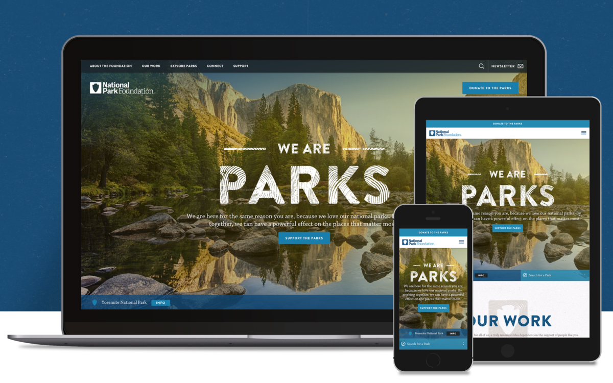
“Let’s Sidecar” —Admittedly, this is a phrase I have failed miserably at installing into our everyday jargon to describe how designers and developers work together, especially when responsive design is taking shape. And even though we toss the phrase around as more of a joke now to describe a very particular project activity, the sidecar analogy is a handy device to describe the overall responsive design approach that Senior Developer Alexis Findiesen and I adopted for our—ahem—award-winning collaboration on nationalparks.org. Well, I think anyway, so hear me out.
A Little About Responsive
The concept behind a responsive site design is the primary look and feel of the site should stay as consistent as possible across all screen sizes. This sounds simple enough, but as any designer or developer reading knows, that oversimplifies the nuance required to close the gaps between desktop and mobile.
In this case, a picture is worth a thousand words. In a competitive sidecar racing duo like the one above, the passenger in the sidecar will shift and contort their bodies all over and around the vehicle for the purpose of optimizing its center of gravity as the rider maneuvers the bike through the corners of the track. We use the term “sidecar” very purposefully to point out the choreography required between designer and developer once the site build is underway. To use the analogy, the developer is like the rider setting the course, and the designer, the passenger interpreting and amplifying the rider’s inputs.
Committing to Responsive
At CHIEF, we know commitment to responsive design is a commitment made to another person. Similar to those competitive racers who choose sidecar racing (for the challenge and the strange beauty in the awkwardness, more than likely), we choose responsive design because we need our collaborative partners and we work better together than apart.
The rider has a bike that is unwieldy by itself, requiring too much of her attention for her to focus on every input it requires. And the passenger, who has a feel for the track and desire to race, but doesn’t have a bike. They are perfect compliments.
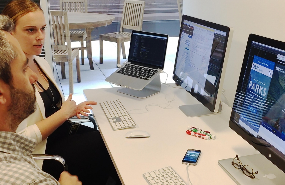
Alexis and Zaid sorting out some mobile nav details
Alexis and I sorting out some mobile nav details in the NPF huddle space.
Test Run
Alexis and I have worked together on four major website redesigns. We know our sidecar approach works. And we’ve each learned to lean on each other to provide guidance. I often show her designs before anyone else—ahead of project managers, UX-ers or design peers. Even if all of the detail is not quite there, with a rough comp I can at least communicate my intention for how I will proceed while giving Alexis—the one ultimately responsible for building that stuff—a chance to weigh in on the feasibility or practicality of it all.
And even if the comp is rough, it sets up our all-important dialogue about how the pages will look—just like a test run on a race course helps the driver and passenger learn the turns of the track while developing a mutual understanding for how we will navigate the course and what or respective roles will be along the way.
Design as a Guide, Not Handcuffs
Coming out of our test runs, we can start to put together a more solid picture of the site. This is where I broke off on my own to develop the set of page designs that would go in front of the client for review and ultimately prescribe the look for all of the major pages—from home page, to article and section landing views.
Intentionally missing from those client-facing design sets were mobile views. That way, the necessary design decisions are more open to interpretation. The couple of mobile mockups I did create were intended almost exclusively as design direction for Alexis. They served as a primer for sorting out how the desktop experience would morph to suit the mobile screen with the greatest attention to detail being paid toward look and feel of the navigation experience.
Much of the rest was left undefined and left open to Alexis’s interpretation. It is her bike after all, and she knows intrinsically how it wants to move.
The Finish
Now with the build well underway, the sidecar took its most literal form: Alexis and I working side-by-side, in a cramped break out space with very questionable air quality controls. With a quality air freshener in place, Alexis and I began doing a bit of collaborative QA to highlight display issues and iron-out plans for addressing the more nebulous details. In some ways, a lot of the slop that needed attention was completely anticipated. In other cases, the result of flawed planning or execution.
We set to work finalizing all of the remaining detail—point sizes and margins at various breaks between desktop and mobile; image scaling behavior; more adaptive interactions like menu and form interactions. In most of these cases, Alexis will have had some bit of code started or prototyped and ready for me to review and refine. In some she had it dialed in already. We moved through each item, turn by turn, shifting and adjusting our way to the finish. And we couldn’t be happier with the results.
This article was originally published on the CHIEF Agency’s blog. CHIEF’s Director of Marketing Strategy will be speaking at Government Digital Communications, September 19-21, in Washington, DC where you’ll see real examples and gain practical advice from digital communication professionals.