

By Stacy Wilson, ABC | Eloquor Consulting, Inc.
With all the new online tools, card sorting is easier than ever to implement. The tough part is, knowing what to do with the results.
We focus on several important findings when we do card sorting:
- Patterns in how participants grouped the items
- Similarities in how participants labeled their categories
- Differences between demographic groups
Each of these point to specific direction for the design process, but let’s focus just on the patterns in grouping for this post.
For those unfamiliar with card sorting, it entails providing participants with a list of items they might seek on a website – both topics and tasks – and asking them to sort these into categories, then labeling the categories. We used to do this with flash cards, watching the participant sort on the table between us. Now, we use electronic tools that enable anyone from anywhere to participate. The downside to the electronic tools is that we cannot observe the participant while they complete the task.
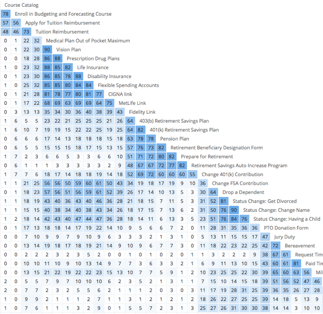
Part of a “Pairs Map,” which shows relationships between items in a card sort;
the darker the blue, the stronger the relationship
How your participants group the items in your card sort tell you a lot about what’s important and what type of navigation will be useful. Here are some helpful examples:
- Items consistently placed in 2-3 different groups probably should be linked from more than one category.
- Items left in a Do Not Belong group may be the result of broader issues. For example, in one test, communication tools for managers were consistently left out of the Manager Tools category because “communication” hadn’t been communicated as a manager responsibility. Dig deeper to understand the cause of such omissions.
- Categories that participants used with success – meaning they put in everything you’d expect them to – can be counted on in your navigational design. Categories that have items that don’t fit, or are missing items that obviously do, should be further tested. They may need different labels to fit user expectations.
- Open-ended feedback often offers interesting findings: in one test a number of participants pointed out a group of items they felt were missing from the test. The list planners hadn’t associated this group of items with the other list items. After further investigation, they added the group of items to the site being tested.
You can see from these examples that sometimes the results enable us to make strong decisions about layout and design. Other times, we have to conduct more testing to confirm or refine findings. Either way, being open to feedback ensures a user-centered experience that meets business needs.
If you are interested in learning more about intranets, their governance and social technology use inside organizations, Stacy Wilson will be teaching at two upcoming events:
- IABC’s Southern Region Conference in Denver in October 2015
- American Bankers Association’s Marketing and Retail Conference also in Denver in October 2015
You might also be interested in attending an upcoming Intranet & Digital Workplace conference, hosted by Advanced Learning Institute:
- Intranets, Content, & Collaboration in Las Vegas in December 2015
Do you have a great case study or story to tell? Submit your presentation to both Advanced Learning Institute and to the IABC 2016 World Conference call for presentations. The latter closes September 30, so get on it!
Stacy Wilson, ABC, Eloquor Consulting, helps companies communicate more effectively with employees in the digital workplace. Her specialty is supporting governance, usability, content and adoption for digital workplaces/intranets, along with change communication for technology change such as ERP implementations. Connect with Stacy at LinkedIn or on Twitter, or with Eloquor on Facebook.